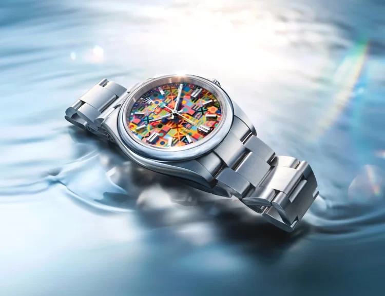
Rolex doesn’t usually play with colour like this.
And when it does, it’s never casual.
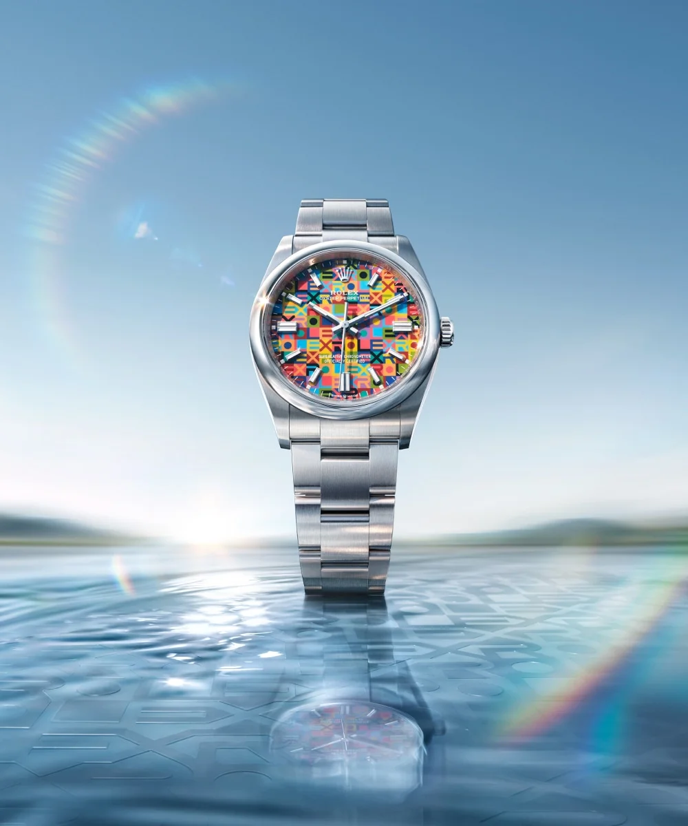
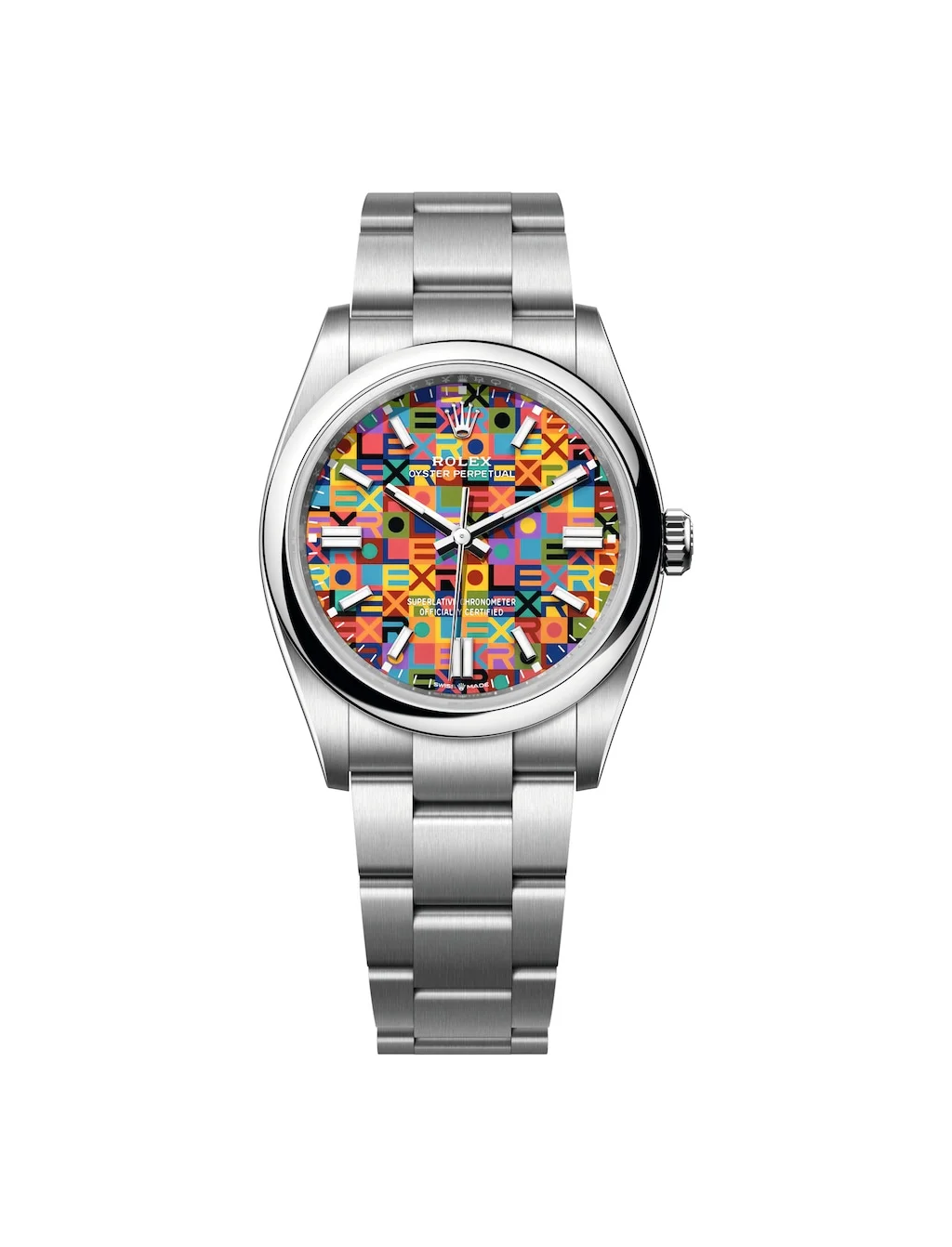
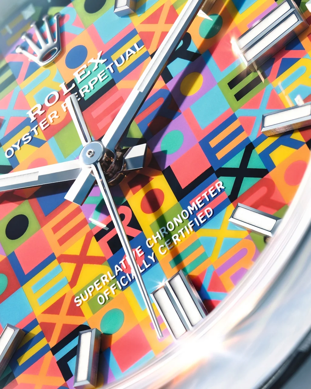
The new Rolex Oyster Perpetual 36 looks playful at first glance—but give it a moment, and it settles into something far more familiar.
This is still Rolex. Just… confidently more vibrant.
The POV
There’s a fine line between expressive and excessive. Most brands either cross it—or avoid it entirely.
Rolex walks it.
A multicolour dial. Repeated lettering. A motif that immediately draws the eye. On paper, this should feel like too much.
It doesn’t.
Because nothing here is random. The colours are measured. The layout is controlled. Even the repetition of the Rolex name feels structured rather than loud.
This isn’t Rolex chasing attention.
It’s Rolex exploring just how far it can go—without losing its identity.
What’s New
- Multicolour lacquer dial with a revisited Jubilee motif
- Rolex lettering repeated across the dial as part of the design
- A colour palette that feels refined rather than loud
- Classic 36mm Oyster case retained
- Automatic movement with Superlative Chronometer certification
- Oyster bracelet with Oysterclasp
No reinvention of the watch itself—just a shift in how it expresses itself.
Technical Breakdown
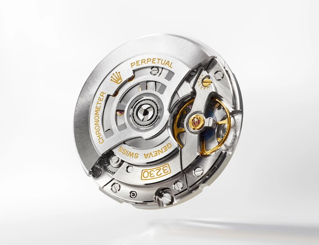
Movement (Under the Hood)
Inside, nothing flashy—just one of Rolex’s most reliable engines.
- Calibre 3230 (in-house automatic movement)
- Approx. 70-hour power reserve
- Chronergy escapement for efficiency
- Parachrom hairspring for shock and temperature resistance
In real terms:
You can take it off for a couple of days, put it back on, and it just keeps going.
Case & Build
This is where Rolex stays uncompromising.
- 36mm Oyster case
- Oystersteel (904L corrosion-resistant steel)
- Screw-down crown with Twinlock system
- Monobloc middle case construction
- Water resistance: 100 metres
This is still a daily watch at heart—built to handle life, not just sit in a box.
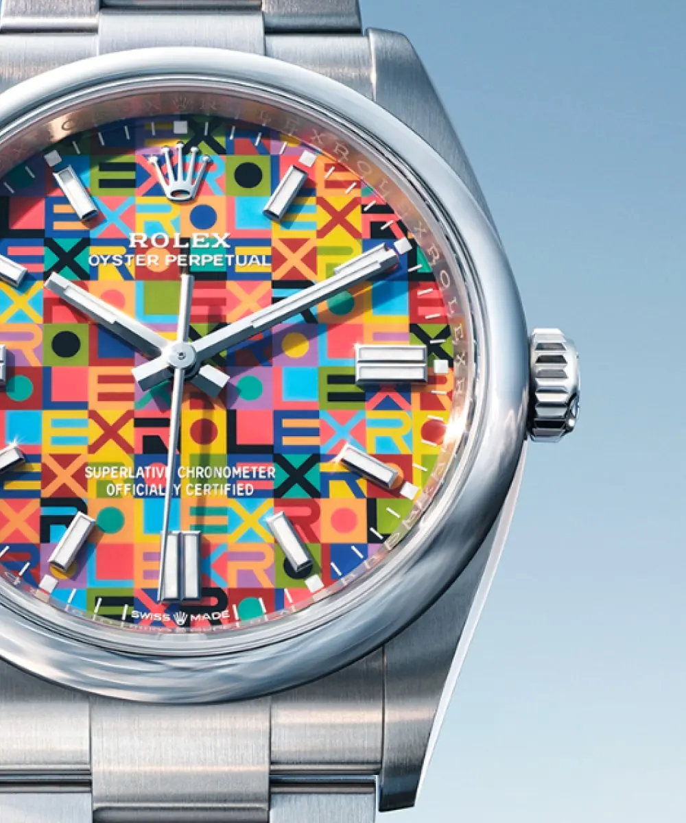
Dial Construction (Where It Gets Interesting)
What looks playful is actually highly controlled.
- Multiple layers of lacquer (built up gradually)
- Controlled environment during production
- Finished with varnish and polishing for depth
That colour isn’t applied—it’s built. Slowly, layer by layer.
Bracelet & Wearability
- Oyster bracelet (three-piece solid links)
- Oysterclasp with Easylink extension (5mm comfort adjustment)
Small detail, big impact—this is what makes it easy to wear every day.
Legibility & Everyday Use
- Chromalight display (long-lasting blue lume)
- Clean, highly legible dial layout
Even with all the colour, it still reads like a proper tool watch.
Certification
- Superlative Chronometer certification
- Precision: -2/+2 seconds per day
Rolex doesn’t just test the movement—it tests the finished watch.
Design Breakdown: Why This Works
1. The Colours
They’re not aggressive. They’re controlled, slightly softened, and intentionally balanced.
2. The Jubilee Motif
Less decoration, more structure. It gives the dial rhythm without overwhelming it.
3. The Rolex Lettering
This could have been too much. Instead, it becomes texture—part of the design rather than branding.
Why It Matters
Most watches try to stand out.
Rolex doesn’t need to.
So when it chooses to do something visually different, it’s worth paying attention.
This watch shows that Rolex can experiment—without ever looking like it’s trying too hard.
And that’s rare.
Who It’s For
- Someone who already owns a classic Rolex
- Someone ready for a bit of personality—but not chaos
- Someone who values detail over obvious statements
This isn’t a first Rolex.
It’s a considered one.
EyesOnTime Verdict
This was a bold move—and it pays off.
What could have felt bright, busy, or overdone… doesn’t.
Instead, it comes together as something balanced, controlled, and entirely intentional.
This isn’t Rolex changing direction.
It’s Rolex stretching—just enough to remind you how good it is at staying itself.